Visual Discrepancies
by Brent Hallard
Visual Discrepancies – December 15, 2009
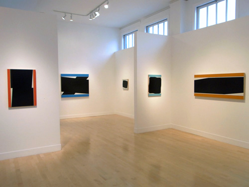
November 2009, Gregory Lind Gallery, San Francisco, CA
Brent: Upon entering the gallery, your first show on the West Coast, San Francisco, Gregory Lind, immediately you become aware of all that is color. Oddly it is not the black that pushes its presence first. But like a good friend, faithful, the blacks unfold at a different speed, which require the intimate. If dark be the turbine then color is the outwardly expressive, and is the meter. In the exhibition space this is what travels across to us in calibrated splendor.
Don: Your response sounds similar to the reaction people have when coming to my studio for the first time. Having seen a painting or two in various group shows they would expect the studio to be a dark and perhaps foreboding place. Often the first words uttered are, “Wow, look at all this color!†I think this explains why salon style installations of my work have been done in a few exhibitions. It replicates the experience of seeing the work in the studio.
Brent: Some of the work in this current show seems to be bent on finding harder and harder angles to work with. And there are a few other surprises too. But first I’d like to start with a sketch. At the restaurant later that night, after your opening, you drew a plan on the paper tablecloth.
Don: With the doodle I was trying to illustrate the origins of where I am in my work today. In 1980 I began working with imagery derived from floor plans of places I worked in or lived in. It was an attempt to attach a subject matter to abstract shapes. (I think of subject as separate from content. Subject matter is a vehicle for content but not a necessity for an artwork to have content.) The drawings were basically a quick sketch with marks to indicate the location of certain architectural features, doors, windows, stairs, etc. These were not hard edge and exacting architects’ blueprint drawings, more along the lines of what a carpenter might sketch out to visualize where certain things would go. Over time the paintings became more and more geometrically structured and less about a specific place but retained a reference to architecture.
Architecture is all about defining space. It delineates boundaries, opens up points of access, entry or exit, and enables one to interact within a defined space. These ideas informed my work as I searched for a way of creating an active and visual space in the paintings. The attempt to locate a unique spatial quality for my work has long been its driving force and finally determines the resolution of a particular painting.
Brent: When I think “architecture†I am immediately turned to something that has to stay up. The openings and closings, the thoroughfares, need structural hinges for them to work. So the spaces adhere to a fairly strict engineering principle of a bearing-load value. This is how we get the width for the opening of the door.
I’m thinking of a plan portion of the architecture – this feel for defining/ opening. There is something missing in a plan, which you see or get when you are physically involved with the architecture. Some say this is the weakness of painting, that in a traditional sense you only get one side of it. But then painting is about a different kind of defining opening.
I remember asking why you did this – create sketches or plans as paintings, and I think I remember your answer correctly, but I’ll ask again. The interesting thing is that the paintings are not based on imaginary spaces. Though you must have had to move around a lot to get a number of these paintings done.
Don: Let’s not over think this. I was trying to break away from how I was taught to do things in art school where a more improvisational approach was celebrated and encouraged. I was having difficulty finding a compelling rationale for what I felt were arbitrary compositional decisions and I was looking for a way of making paintings where I wasn’t following all their rules. Floor plans provided a personal reference and the placement of forms was predetermined. If a composition was unbalanced because of the locations of the real life objects I wouldn’t just move them. I had to find another way to make it work. Color, weight of the marks, something… The first floor plan I used was from a small carpentry job I was on in Tribeca. This was a simple square room with a raised platform with three steps, an inward swinging door and three windows. Another floor plan was of a room I had in Portland, Maine where I had a bout with kidney stones. I painted it red with a blue undercoat to suggest oxygenated blood. These were done with various materials on mulberry paper.
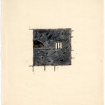
Harrison Street, 1980, acrylic and graphite on paper 20 x 17 in.
Then when I decided to try to do these on canvas I had to figure out how to make that transfer. I drew the image in the center of the canvas and colored the ground around the outside of the shape I had drawn. This was the beginning of my use of a border or frame of color around the perimeter of the paintings. I thought it helped to create the space, gave you something you had to ‘step over’ to get into the picture. A violation of the sanctity of the picture plane!
After a while I began to “run out†of rooms I had a personal connection to and found interesting enough to try to make a drawing out of. I started researching architecture books. I found interesting ideas in books on Leon and Rob Krier, Carlo Scarpa, Melnikov, a whole gamut, medieval, colonial, contemporary, whatever peaked my interest. After a while I just focused on parts of the room plan, architectural details, cutouts, stairwells often provided the imagery.
Brent: So, in a way, we are talking nature – the blue prints. With these “detail†drawings how did the border and edge figure? Was the framing dropped, or did it get relegated to one side, with the color and mark continuing to do the balancing act? Or was it a matter of staying with the centered image? All this back in the eighties, right: Peter Halley, Sherrie Levine.
Don: Yes. I was no longer in Maine; the city had become my nature. In a way New York City is very organic, it’s always changing.
I stayed with an overall centering; the privileged architectural detail was centered and contained within a field surrounded by a colored border. Symmetry has been another way for me to avoid arbitrary compositional decisions. I’d been at this for a couple of years before I first saw Peter Halley’s cell and conduit paintings with which I felt an immediate kinship (but my work wasn’t so theoretically driven). The art world had been dominated by Neo-Expressionist painting at the time, so Neo-Geo was a welcome respite from that mess. But then Neo-Geo got mired in French Post-Structuralism. What I liked in Sherrie Levine’s work or Peter Halley or David Diao for that matter might have been for all the wrong reasons. When I first saw Dan Walsh’s black and white or yellow and white paintings from the mid-nineties I felt a connection to and understood the diagrammatic nature of his work. I had been at it with the black planes already for a few years by then but I recognized a sensibility at work. It’s been really interesting watching his work evolve.
Brent: You say you stayed with the centering device, though the image on the cover of ‘The Downtown Review‘ suggests otherwise… do you want to rephrase there, or clarify? It’s a great little image.
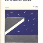
Downtown Review Fall 1980
Don: That image is an exception. I always do one of those once in a while. It seems to clarify the general run of things by contradicting myself a bit. That image could read as a diving board out over a body of water. It’s an obvious play with perspective. (I did like some of Hockney’s pool paintings.) Like K. Bradford wrote at the time: “It will be interesting to watch just how much imagery and content Voisine’s particular brand of “informed formalism†can absorb before touching on outright representation.†We all know how that turned out. This period was just the beginnings of my work. Its development has never been clear-cut and linear for me.
Brent: These exceptions seem to happen all over the place with you… when you start to notice. Dan Walsh, architectural placement, diagrammatic, even Pop driven? Malevich comes up when there is talk of your work, perhaps due to the use of the icon, the black square, the cross, the double reading of space on a flat plane, the spare.
Don: An aspect of Dan’s paintings I like is the fact they are precise but remain very relaxed, casual in feel. They have a certain geometric insouciance. Yes, Malevich is brought up all the time: Most recently about the Styrofoam painting installation in Hamburg. The iconic plays a bigger part in the black paintings, which began in 1990-91. Late 80s grid paintings were very pale and subtle. I found it was easy for people to ignore them. The more explicit black forms made an immediate graphic impact garnering more attention. Drawing them in like a carnival barker.
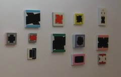
2009 Installation: pp Projects, Hamburg, Germany
Brent: The soft and pale was replaced with a more popular op keeping the framing device, the intersected, and while this perhaps did not mark the work more accessible it definitely enhanced the visible: The Styrofoam pieces demand that you work and think differently. Was there some kind of accessibility drive going on there?
Don: No, that was never part of the impetus for painting on Styrofoam. After the fact I noticed people reacted differently to them in comparison to the wood panels. But their small size and “objectness†relates them to icons and Malevich certainly considered those as a factor in his work. The small wood panels also have icon-like qualities.
Brent: In which way differently?
Don: People seem to get a little kick from noticing that this formal imagery, with dark geometric forms, is on such a cheap lightweight disposable material. The Styrofoam paintings are a little funkier, convey a bit less gravitas, and suggest a quality of humor not associated with serious reductive forms. I pretty much paint them the same way as on wood but the surface prep is rather dissimilar. I coat the Styrofoam with a two-part plastic epoxy which protects the foam from the paint solvents. It makes a hard shell surface with slightly rounded edges to paint on and lends itself to a different read. It’s interesting to have a side project that runs parallel to the main concerns of my work but gets its own unique response.
Brent: When I refer to icon, I guess I am thinking less in terms of “objectness†or “devotion†and more related to a graphic symbol, which has been reduced to “an essential†that in context is clearly readable. To borrow from the computer… we are sensibly able to click on the icon to enter.
This framing device, which was already present in the early carpenter drawings as the white space left around the plan view, really starts to make sense with ‘Yellow Grave‘ 1981, a largish piece on canvas, 81â€x 66â€. Like it or not it does have this comic/pop element that allows you to enter with some kind of knowing. The framing, however, deals with painting’s formal issues, what to do with the sides as they approach the edges, and how planes are dealt with on a single surface. These “hatch marks†are becoming less in number. In this particular painting they are flying off and cutting into the border’s color. The feeling is formal juxtaposition, harmony: Adding, ahead of its time, a touch of Itchy and Scratchy.

Don Voisine, Yellow Grave, 1981, oil on canvas, 81 x 66in.
Don: No prescience on Itchy and Scratchy there. I was looking at Philip Guston at the time. His retrospective came through New York in the summer of ’81 and he was a big fan of George Herriman’s classic cartoon “Krazy Kat.†I’m not a connoisseur but comics and animations are all part of our conscious or sub-conscious cultural DNA. ‘Yellow Grave’ was something of a breakthrough painting for me. It set the course of my work for the next 5 or 6 years and certain features have remained a constant to this day. ‘Yellow Grave’ had the immediacy of a “big drawing†but it was on canvas and made with paint. The yellow border anchored it as a painting. By the end of the 80s I’d probably lost that sense of immediacy but I think I found it again with the black paintings, especially now with the diagonals zipping across to and fro.
I’ve always strived for an “essence,†whether of place or of a specific space, that’s part of what initially appealed to me about abstract art. I don’t think my imagery became iconic until I began working with the predominately black forms, which made a more immediate graphic impression.
Brent: More yellow border, this time (give me a season–summer, spring) ‘88, with a title ‘Piet 1’. Guston and Krazy Kat fade. The work deals with formal things, heavy formal things manipulated in the slightest possible fashion. You say with a lost immediacy, I can’t judge. Here it is good, even if slowing in subject intervention. There is consideration of space, the line, where it sits, how it sits not arbitrarily. In ‘Piet 1’ the space hums. The taut lines are spaces too. Spaces delineating spaces, is what you get. The yellow pours over the whole experience. To the right the top line has a little nick that sends the work into some “known illusion†though it is not fulfilled. Then, ably back the articulation opens into another realm: Paris, Mondrian, California, and John McLaughlin.
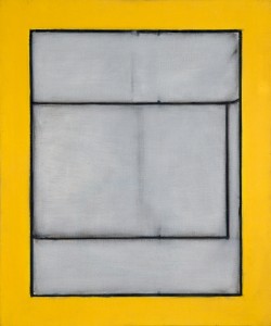
Don Voisine, Piet 1, 1988, oil on linen, 24 x 20
Don: Spring or summer, I can’t recall for sure, could have been fall. Whenever I start a new thread in the work I go back to a very basic approach, just putting down the idea very simply and directly to see if it can fly before pushing it out to test its range. By this time I had run through the floor plans and the paintings were beginning to get a little baroque, fussy and overly detailed. The artistic discourse in New York was about appropriation and the End of Painting among other things. I strongly disagreed with this view and with a painting like ‘Piet 1′ I was simply trying to see if I could make something new through appropriation, not use it as an endgame strategy. Borrowing to grow on, to keep painting rather then bury the medium. The layout of the lines relates to a Mondrian painting which I had to fit within a different format then the original. I continued mining this vein for a couple of years and that’s when I felt the paintings began to lose their immediacy. The grids became more hard edge but at the same time ghostly, they were buried under a whitish scumbled veil. Looking back this probably was not the most fruitful direction to go in but sometimes you just have to do the work to get on to something else. For some reason I became very interested in black paintings, early Stella, Kelly, McLaughlin, that magnificent gigantic black Clyfford Still at the Art Institute of Chicago, and of course Reinhardt. They always seemed to be among the most difficult, challenging and least seductive paintings around. I had to give it a shot.
Brent: And black becomes. ‘Fall’ 1992 returns to centering – the hallmark, still, as yet, not ready for the admission of the diagonal. The orange frame distinguishes the edge of the painting from the wall and weighs strong enough to handle any incongruity when looking slightly from the side. A white cross is painted just in from the border (one rectangle at a time), ostensibly creating another floating edge, over which a dark rectangular motif is centered just within the white cross to provide four notches, a hold that can be visually interpreted as partial presence of another border. This painting then appears to be about edges, borders and crossing them.
Very simple questions: Are you taping the edges? They look clean but the paint application still reads fairly plain and simple. In the image supplied there doesn’t yet appear that deft crispness. And this may have to do with the smallish scale and still working with canvas?
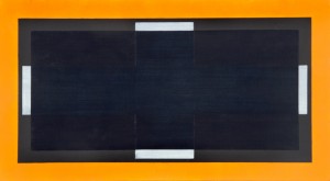
Don Voisine, Fall, 1992, oil on linen, 22 x 40 in.
Don: I was making similar paintings up to 6 or 7 feet on linen at the time so I don’t think scale has anything to do with the crispness. My lines and edges became much cleaner when I switched to painting on wood panels.
I am using masking tape on the edges and to separate areas from one another as I paint them in. The straighter and exact the lines the more clearly articulated the space becomes. I have tried to do this without tape; carefully painting along a drawn line, but just the slightest wavering of an edge lessened the solidity of the forms and diminished the overall presence of the paintings. There is a slight build up of extra paint on the edge of taped lines that plays an essential role in the work. In the central area one black plane is laid over another and the built up tape lines of the form underneath the glossy layer is visible. This is important because it indicates the continuity of one plane over or under another. Otherwise the image can read as interlocking planes and suggests a flat cubist space. This distinction is significant in determining how the viewer reads the space.
From the first paintings I did using large areas of dark tones the basics were fairly well established. A band of color around the perimeter set the mood and tone (distinct from the blacks), a (somewhat) translucent shiny black is overlaid on top of a matte black, and areas of white or grays. These off-white spaces were the least worked, sometimes just a wash over the ground, but they actually did the most to activate spatial depth.
Although I got off to a fast start with these, the evolution of the work was very slow. Sometimes the delay was just a matter of life getting in the way of art. I knew I had something with the idea of these black paintings but I couldn’t quite break it open. I kept at it trying to figure it out. In some ways I think I was painting the same picture over and over again. Shifting a line or gap between segments very slightly altered the space, enough to constitute a different painting perhaps, but not showing a wide range of variations. Eventually the possibilities began to open up and I think I’ve found a lot of ways to make complex paintings with strict limitations.
Brent: ‘Untitled, Blue Diamond‘ 1999… OK, so you introduce the diagonal, in a fashion. Following this process that you describe, and I can see, one layer at a time, one system at a time, can you explain how we see two notches, one at the top one at the bottom? It has some optical challenges with a very simple and neat move/ shift, which also suggests that you are (well) on your way to new territory.

Don Voisine, Untitled-Blue Diamond, 1999, oil on linen, 62 x 62 in.
Don: Not so fast! With this I was trying out different formats. I wasn’t yet thinking in terms of movement which is what eventually led me to the introduction of angles, diagonals and Xs. At the time most of my paintings were done on square formats, either singularly or in multiple combinations. As you are well aware, a diamond is a rotated square (* see Visual Discrepancies – One or two Things I know – Linda Francis) and the interior blacks are two equal sized overlapping squares slightly shifted so that one doesn’t totally block out the other. This created the two notches which sort of anchor the top and bottom of this painting. Given the centered stillness of my imagery up to that point I was startled by the visual dynamics generated by the lozenge format. Apparently I wasn’t ready for all this action because I didn’t pursue it any further. In hindsight I can see that this painting was pointing towards issues that have occupied me for the past few years. I still had a few steps to take on the path to making the work you saw in San Francisco.
Brent: “a diamond is a rotated square…†Do we need to bring that up? But in this case we are not thinking in terms of curve, or are we? Though curve or warp space do come up… later. ‘Blue Horizontal Affair‘ 2002, and as we have touched upon in email is a long horizontal piece on wood that pumps up the volume without taking up the physical bulky space. You are generally all on wood from here on in… with these.
The layering is very obvious again. There is a sense of gracefulness, if you understand how a Kanji character gets formed… as I’m here waving my hand in the air through your painting. There is rhythm and great sense of space in the movement, both in the Kanji and with the ‘Affair’ as the mind moves through the physical paces. First sign too of a crack in the border! It’s broken. There are these blue horizontal bands, with the vertical elements still there even though mostly hidden. This piece looks like it took work to complete.
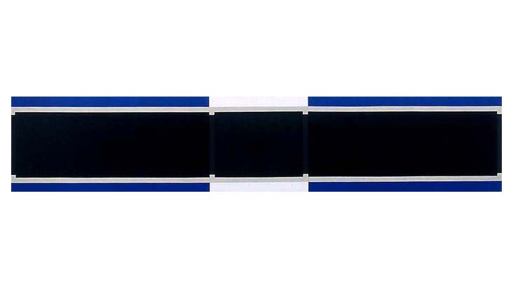
Don Voisine, Blue Horizontal Affair, 2002, oil on wood, 18 x 90 in.
‘Sway’, two years later, and the border is back intact. The layering is very clean. There is this illusion: Introduction to the warp. Every space has a character/ personality. It reads “at attention†and “at easeâ€. I’m almost inclined to think back to Mondrian. Reinvented.
Don: Mondrian is always in the room! Long horizontal formats allowed me to make paintings with the feel of a large piece without the bulk and weight of a big square wooden panel. It could fill your field of vision and engage your peripheral vision as well. Barnett Newman’s ideas on lateral spread and how he wanted a viewer to approach his work helped me work out these pieces. The blue border cut off at the extreme ends and not wrapping around all four sides allowed for a more expansive space, implying continuity beyond the edges of the painting. I continued using both approaches with the borders but recently the bands of colors are mainly on two sides.
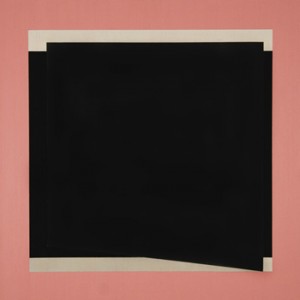
Don Voisine, Sway, 2004, oil on wood, 24 x 24 in.
‘Sway’ 2004, with the bottom side of the top black form set at an angle was among my first foray out of squares and rectangles. I tried this format to introduce more visual activity into a body of work that up to that point was very centered and still. I like your read, simultaneously “at attention†(top half) and “at ease†(bottom half), kind of like a mullet haircut. Although I think this painting works, as did a couple others I generally had difficulty reconciling the illusion of the lower right corner bowing out towards you. I decided to ditch the diagonal and tried to create movement more subtly by shifting the overlays slightly and creating some asymmetry. I was more comfortable with this approach while searching for other options. Along with these shifts I began to introduce an additional thin line of color, creating a little visual buzz at the edge of the border and interior. When I re-introduced angles, diagonals, and Xs in the latter half of 2006 I no longer created a warp in the space of the painting. They were more dynamic and active and the tensions that existed at the edges of the images became more palpable.
Brent: Your new work, what can I say… most are spinning, others are bending, one turns into a cube, “every†has a pair of horizontal color, and in each the black or a part of it extends past the open section. They are animated – animated icons of Color humming “slow down.†But the turbines continue, drenched in their dark matter.
You mentioned with ‘Sway’ you didn’t like the warping. I mistakenly said that the warp comes up again, though “warp†is not the right word. I have this little aversion to warping too, as a word, and for what it implies, but more importantly what this does to space, to the picture plane, and the outer bordering. And there is a way around this. It’s not a mechanical way that is error free, but is sensual… perhaps a negation of opposites?
Don: Or a reconciliation. It’s not something figured out before hand but in the painting of each. I try to make various elements in my paintings to read in multiple ways. For example the white ground can read simultaneously as a positive or negative space, or in another painting the blacks can flip back and forth as to which is over the other depending on how you look at it.
Keeping the picture planes intact is certainly important to me. For all the movement and spatial ins and outs of my recent paintings the planes must maintain an overall pictorial integrity. Earlier attempts to do this created an incoherent image, the warped corner. It’s like looking at a figurative painting where the artist doesn’t have the skill to render the body in space, where the depiction of a limb doesn’t turn naturally. It might look like the shin is pasted on rather than reading as if it flows realistically from the rest of the body. It’s out of whack and the same thing happens in abstract pictures.
Brent: Can we talk about some of the picture logic, which to my mind plays out whack but also runs with a tenuous or dynamic visual sense, one I’m not sure has to do with shins and body fixture… As you suggest each system has its logic, and is tied to the planes, the color, or tone.
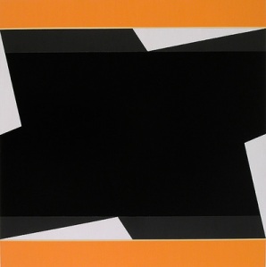
Don Voisine, Fahrenheit, 2009, oil on wood, 24 x 24 in.
With ‘Inauguration’, not in the show, and ‘Fahrenheit’, which is, the common thread here are the nicks, the white triangular spaces that through some sort of uniformity fail the logic of the so-called diagonally crossing bars. The color bars provide some stasis – have the second thin bar running across which in both cases alleviate some of the pressure providing space and float. All, however, tell the cross is skewed, and drive the feeling as something riving within. But you are right there is no apparent collapse. No part of the “gossamer picture plane†is disadvantaged, or slips back, fails, drops off, or falls into a hole. This is how the whole starts to avail greater than the physical constituents. Also we talked earlier about the process/ logic of building a painting. Can you offer that process here, for ‘Inauguration’ and ‘Fahrenheit’?
Don: ‘Inauguration’ and ‘Fahrenheit’ have a symbiotic relationship and there was a third partner involved called ‘Rehearsal’. I was working on ‘Inauguration’ for my show at Mckenzie Fine Art in New York last spring. Rather then figuring out the possible configurations directly onto the 5 foot square panel through trial and error I made smaller panels where I tested the layouts to see how it looked. Working from a study is nothing unusual but it is not my usual approach, besides there is always something to take into consideration when you increase the scale, it’s never worked in a direct 1 to 1 ratio for me. In this situation once I made a decision and committed it to the large piece I’d then try out the next step on the smaller pieces. Once ‘Inauguration’ was finished I went back into ‘Fahrenheit’ and ‘Rehearsal’ and made a few changes, mostly in color, to finish them so as to be individual paintings on their own merits.
You can see how I got the pinwheel effect caused by the “failed logic†of the diagonally crossing bars by comparing ‘Inauguration’ to ‘Basic Space’ (also in the San Francisco show). I drew the tilted X onto the panel then centered the overlapping square over it. Next I pulled some of the lines away from being parallel to meet the crossing line at the edge of the center square. Disrupting the expected linear flow of the crossing diagonals created this sensation of a forward spin.
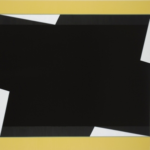
Don Voisine, Inauguration, 2009, oil on wood, 60 x 60 in.
The choice of color for the ‘Inauguration’ was initially inspired by Michelle Obama’s dress at the presidential inauguration last January. The final color had to be adjusted for the painting so it would not match a direct comparison to the fabric but real life observation was a point of departure for the painting. On the other hand the color for ‘Fahrenheit’ was totally subjective and resolved through adjustments in tone and value in relation to the interior blacks and whites. To make another painting I could reduce the size of the white triangular wedges and this would increase the sense of compression of the black forms against the perimeter color, giving the painting an entirely different scale and energy. This is how my work changes and evolves, slowly through repeated explorations of variations and form.
Brent: You are cleaning up the studio.
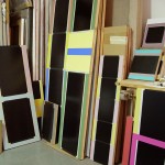
Don Voisine, studio view
Don: I’ve been hard at it for the past couple of years especially with the shows I had recently, I would go to the studio every day and just get to work. It’s not a very large space (450 sq. ft) and I’ve been in there for almost 20 years. Since I’ve returned from San Francisco I’ve been reorganizing the storage and stripping paint off of failed pictures so I can reuse the panels. I’m now ready to step back into the fray.